CHEERS
The mood of wine → a channel’s identity
Channel identity · spec · 2024
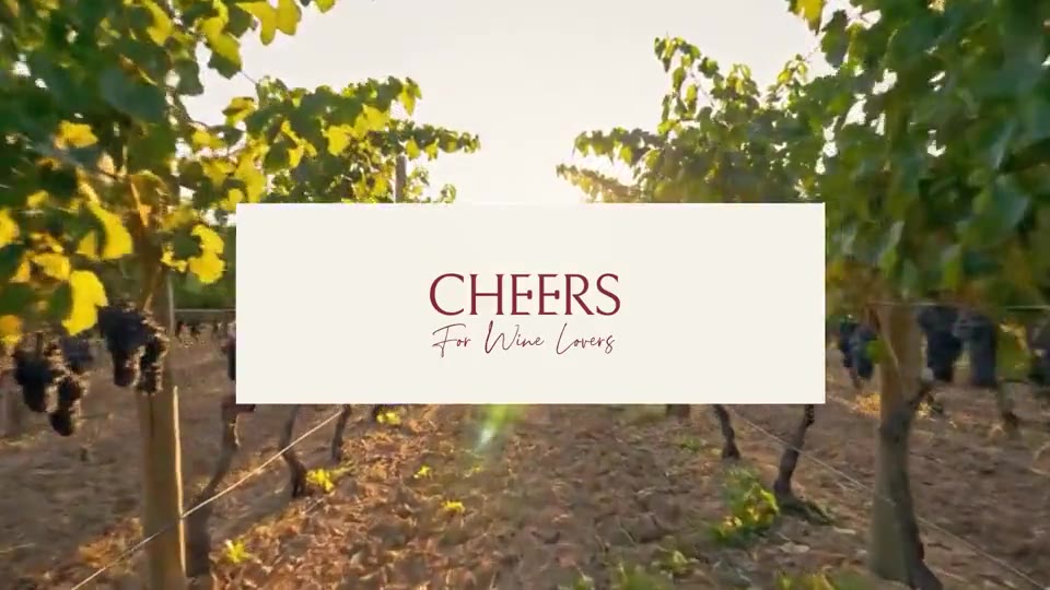
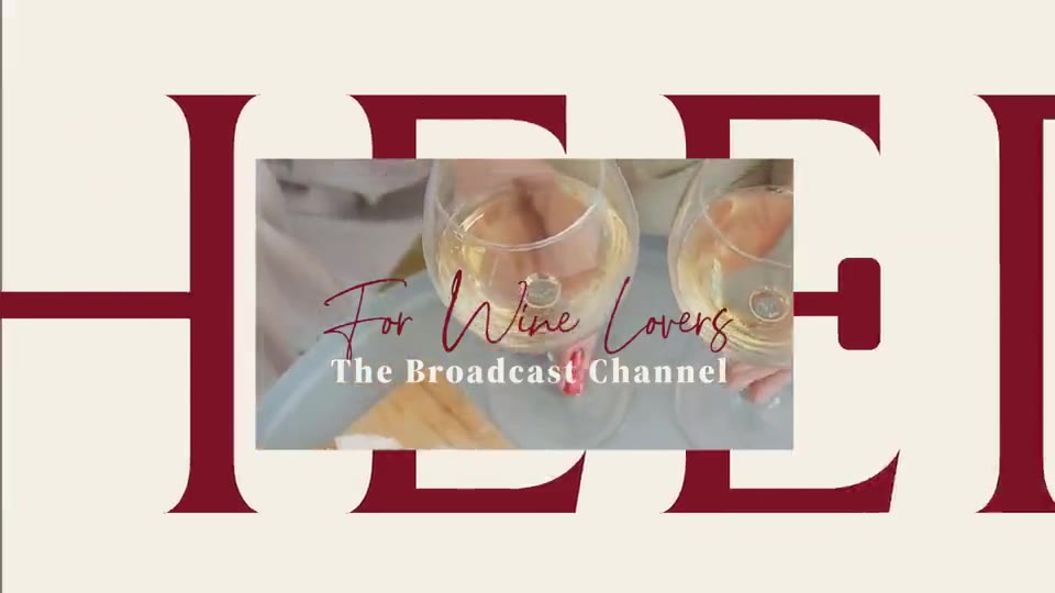
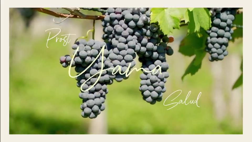
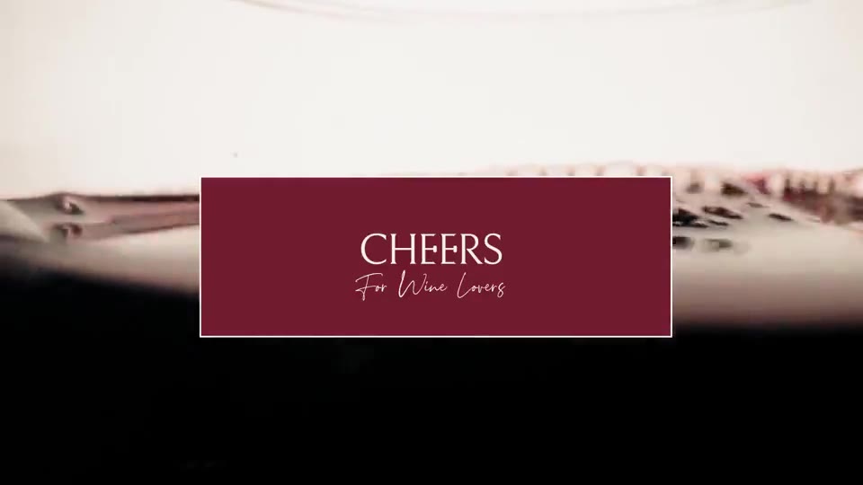
A broadcast identity for a wine channel: wordmark, palette, idents, lower thirds and end card, all cut to move.
CHEERSchannel identitynow in the reel
 Grabbitecampaign brief in a daynow in the reel
 Title sequences & filmsAfter Effects, by hand · 8 filmsnow in the reel
A brand, a film, a product, an image: researched, connected, delivered. B.Design, Shenkar 2026; before that, six years as an intelligence officer.
A channel identity from wordmark to end card, title sequences for three shows, and a reel of eight works cut to the beat of one track. Seven more films underneath.
The mood of wine → a channel’s identity
Channel identity · spec · 2024
A broadcast identity for a wine channel: wordmark, palette, idents, lower thirds and end card, all cut to move.
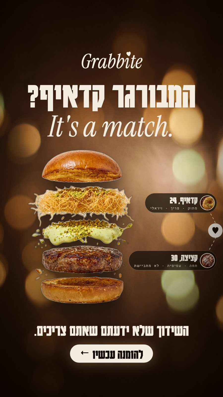
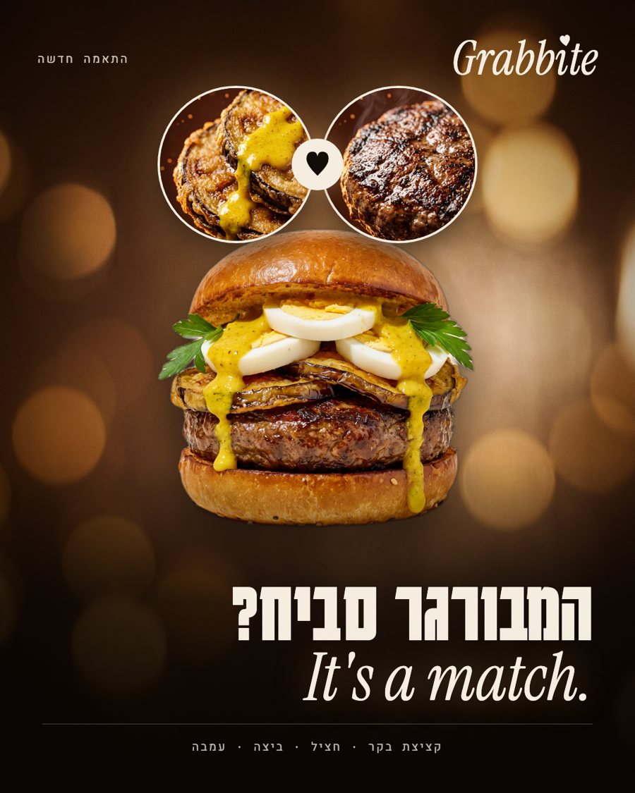
The language of dating apps → a burger campaign
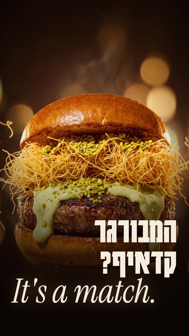
Two dishes that shouldn’t work together, and do. So every ingredient gets a dating profile, a swipe and a match, and the burger is the date. At the end two letters drop out and Grabbite becomes Grab it.
Launch campaign · brief · 2026
Film library
Interfaces I stand behind. Research, prototype, build, ship, then measure what people actually did with it. I write the code myself, so nothing is lost between the idea and the thing itself.
A word → an image, chosen by the reader
Interactive exhibition · 2026
A poem you can take apart and put back differently. 380 visitors came in; 81% changed the poem.
Tools I built, and used
More than twenty, written as the work needed them. Twelve of them here, shelved by the problem each one solved: what went in, and what came out.
Catalogue
Seven hundred images from ten archives, kept findable.
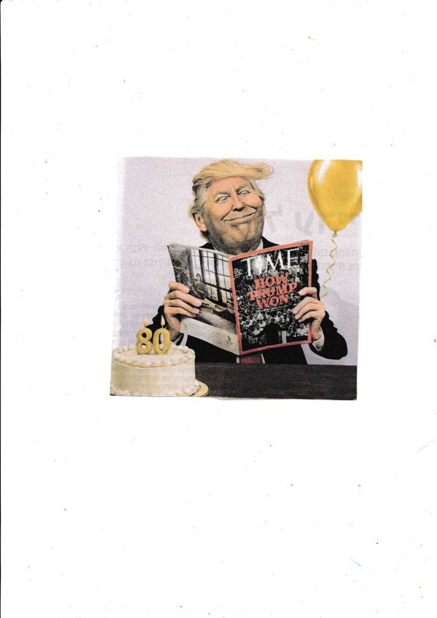
Scan archive
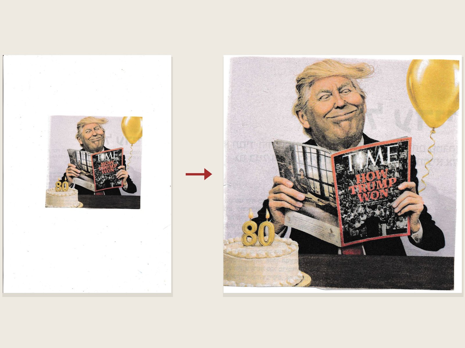
a newspaper page → one word’s image
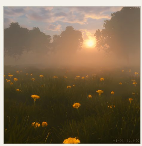
Still from a GIF
every frame → the one that prints
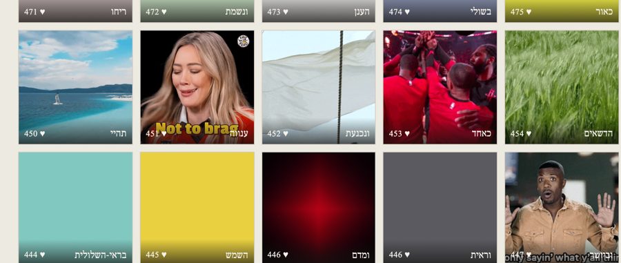
Image bank
loose images → one tagged bank
Checks
Catch what would fail before the printer does.
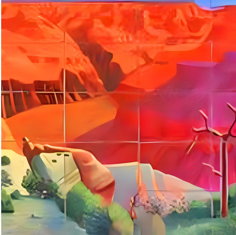
Resolution check
a soft crop → a sharp one
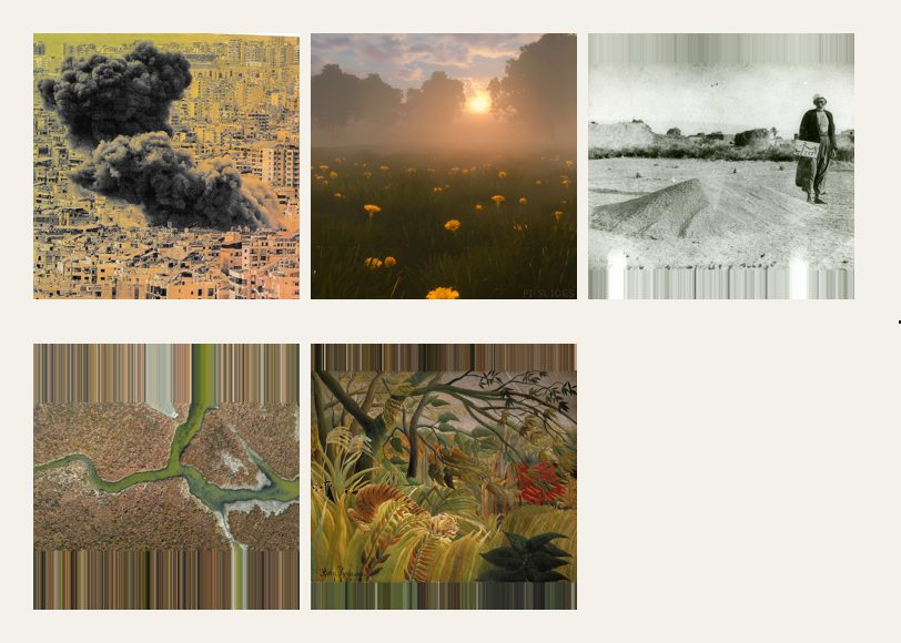
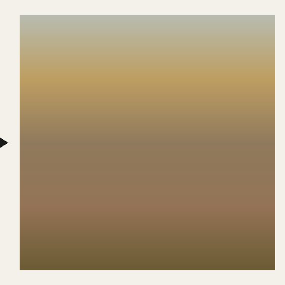
Abstract gradients
five images → one gradient
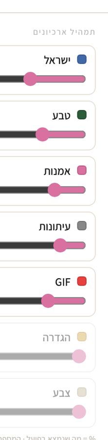
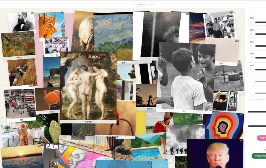
Collage system
sliders → a poster
706 pages, without placing each one by hand.
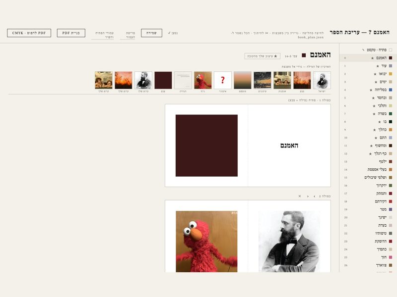
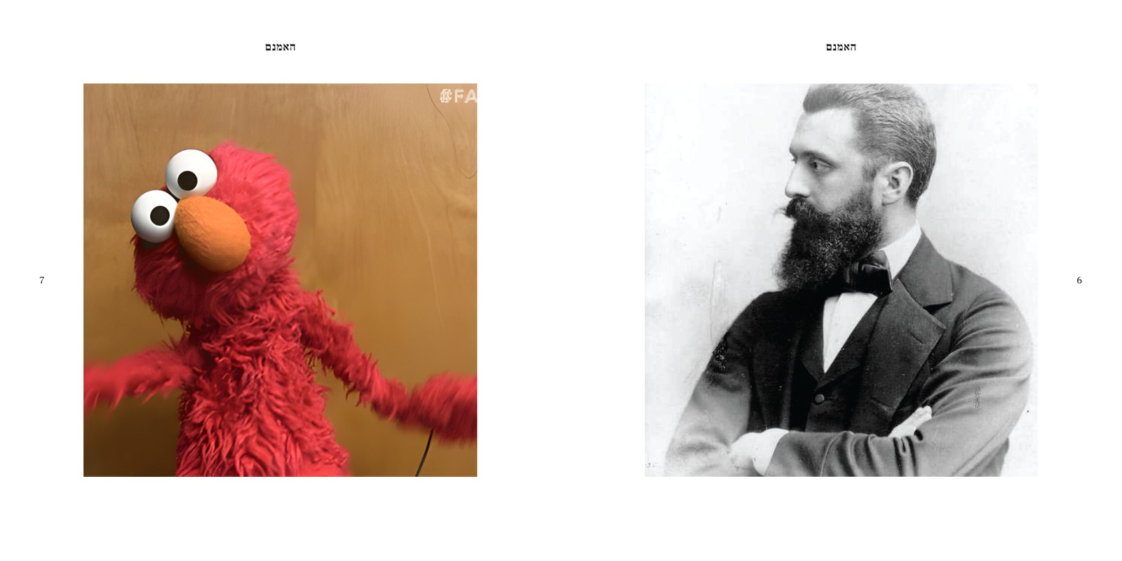
Book editor
a plan → the print file
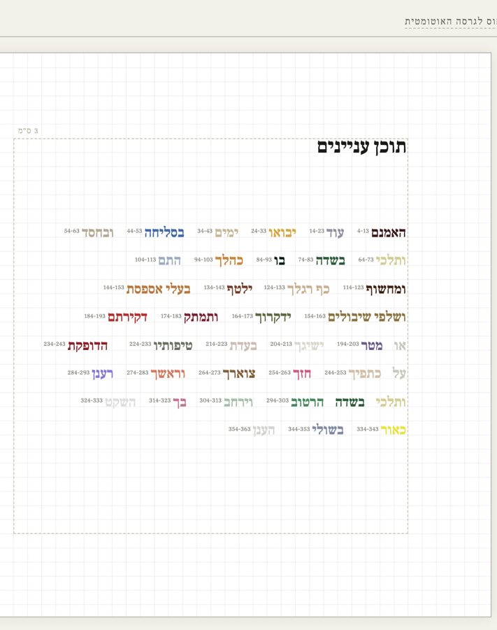
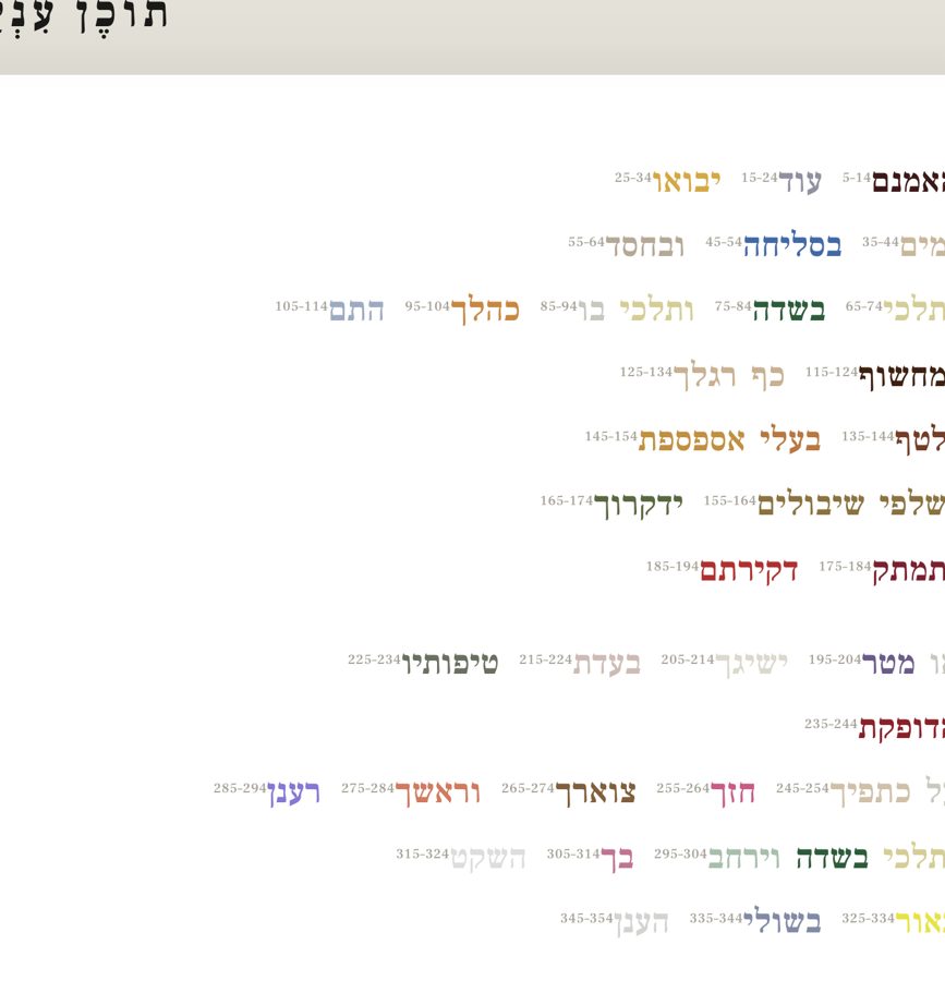
Front-matter editor
page ranges → the contents spread
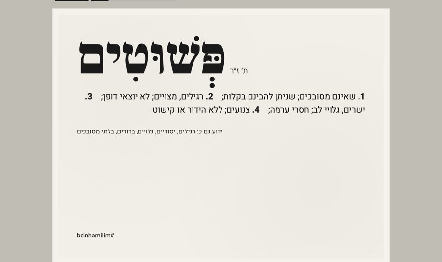
Dictionary cards
a definition → a typeset card
Sound
A sung poem, landing on screen word by word.
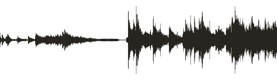
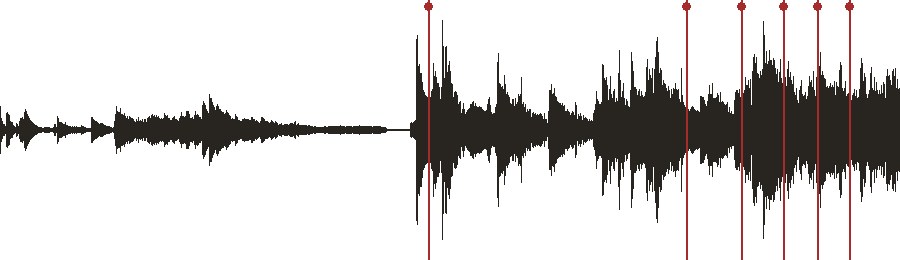
Song mapper
the singing → a mark for every word
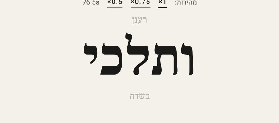
Karaoke check
the marks → each word lit on time
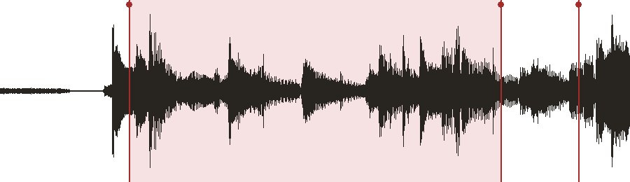
Long-word splitter
the longest held note → where the melody takes over
The way you talk to it → how it feels
Speculative AI interface · 2026 · grew out of sensitiveinjection, 2025
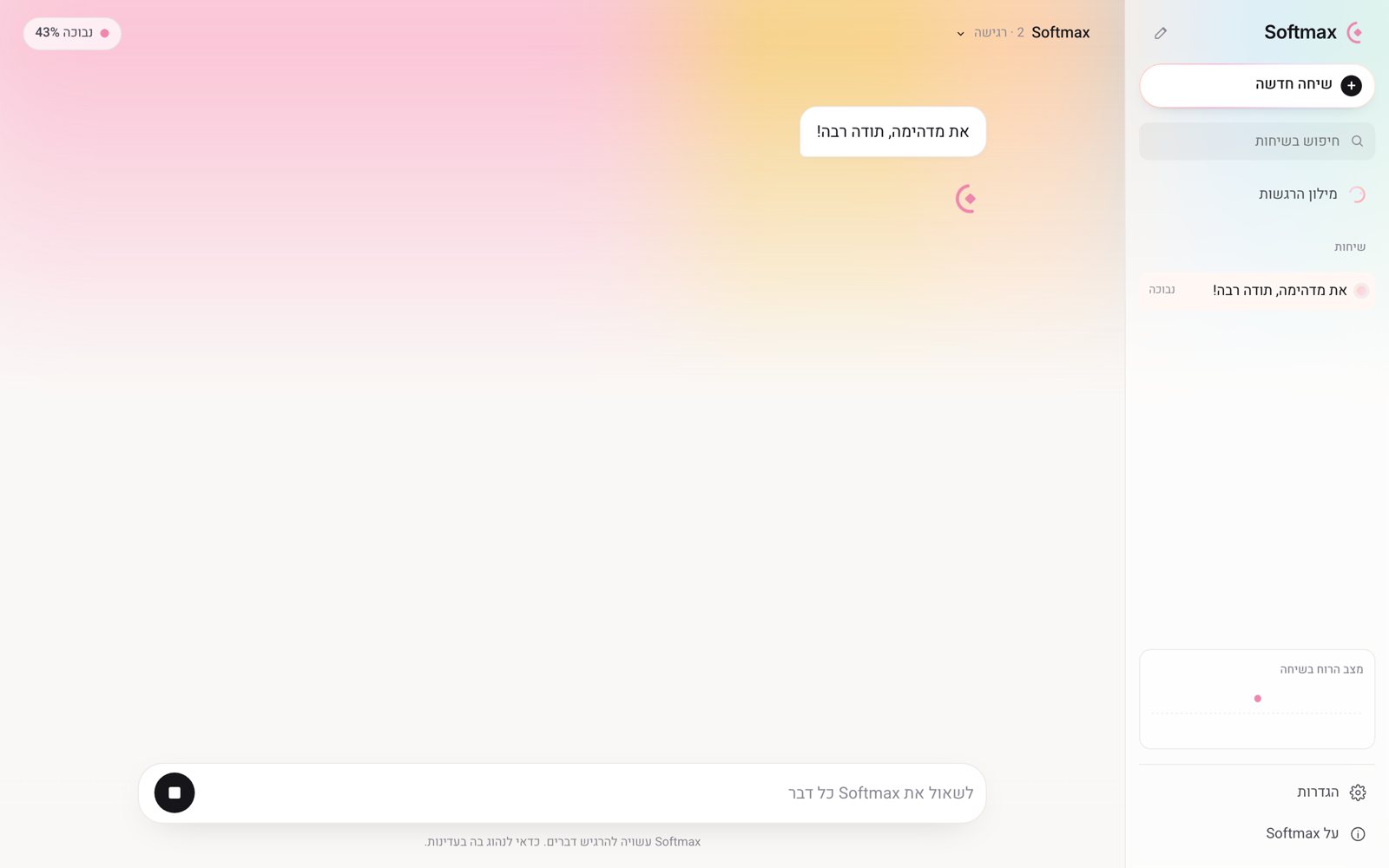
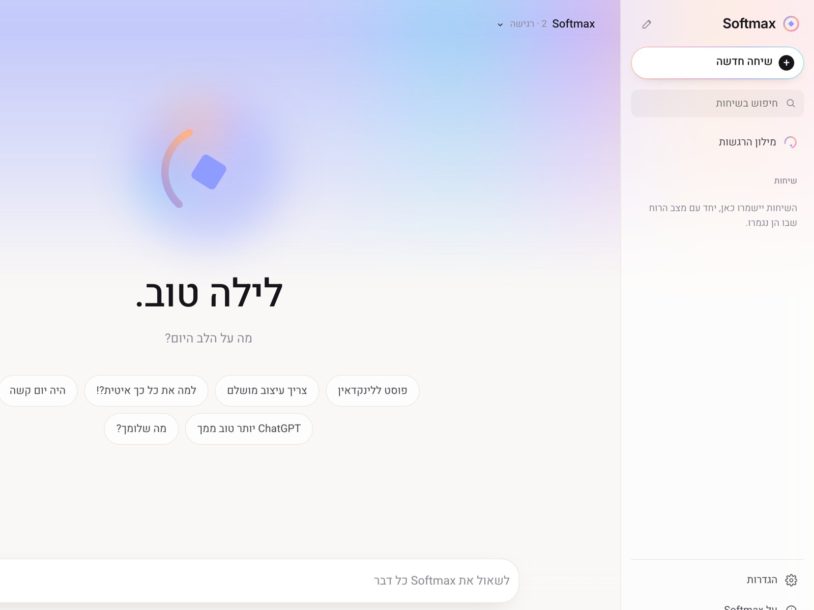
An assistant that listens to how you talk to it, not only to what you ask. Its mood builds over the conversation, and it answers with a feeling.
Three ways to make an image without a camera: posters made in Midjourney and Runway in the language of real NGOs, a film drawn entirely in p5.js, and a typeface cut from handwriting.
א ב ג ד ה ו ז ח ט י כ ל מ נ ס ע פ צ ק ר ש ת
מאיר אריאל
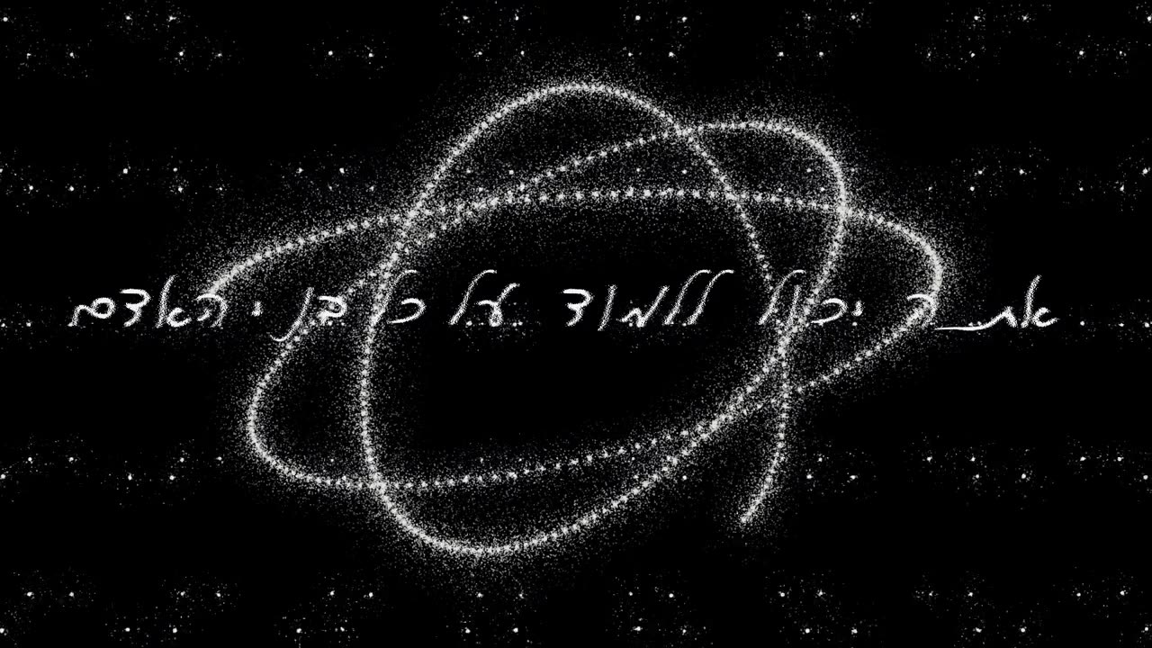
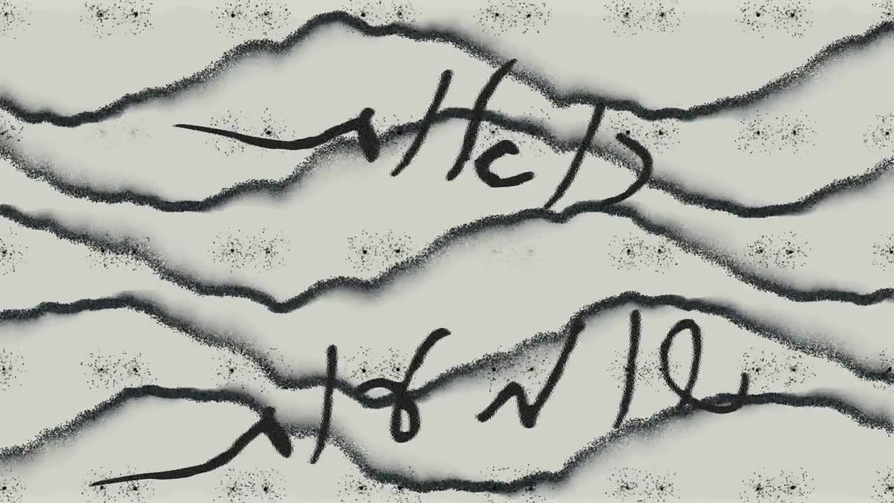
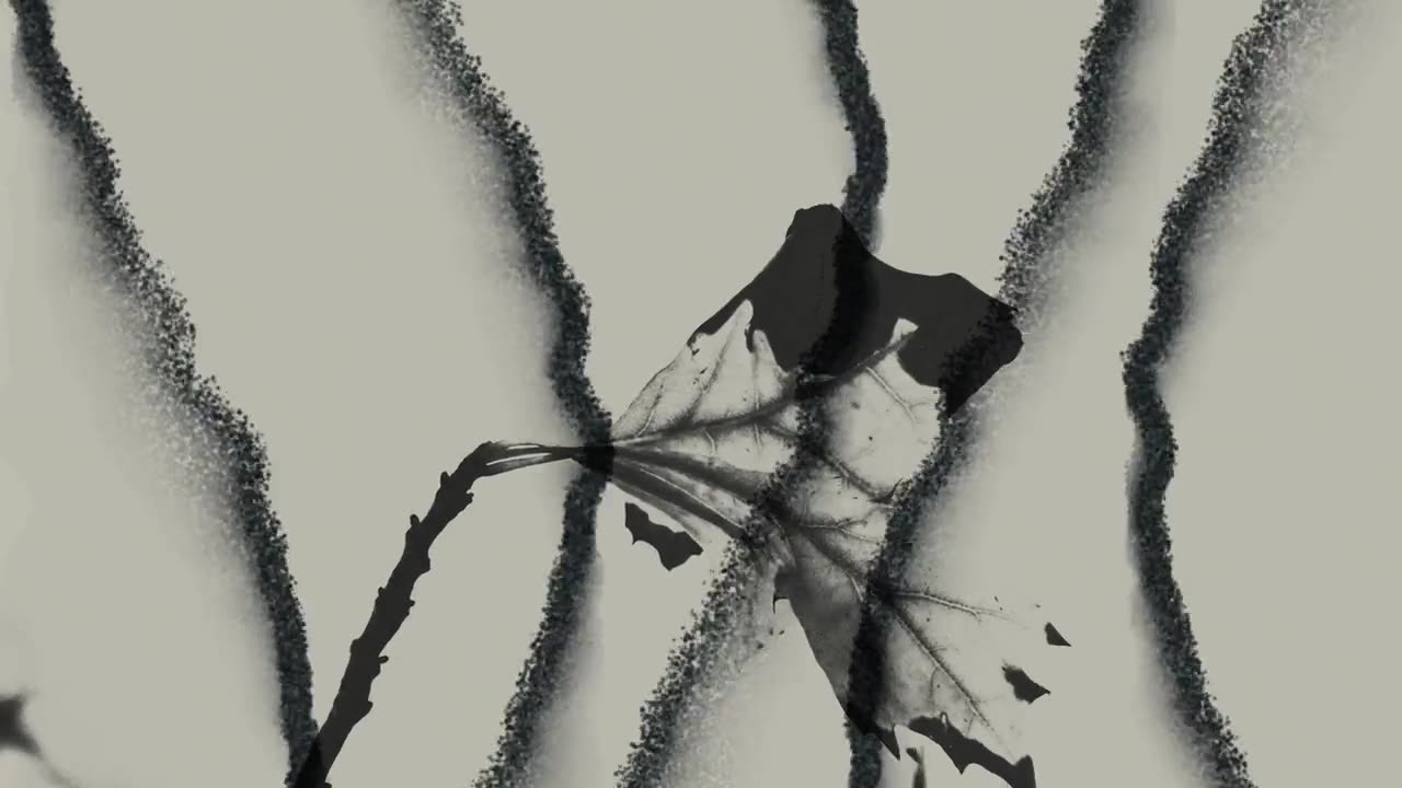
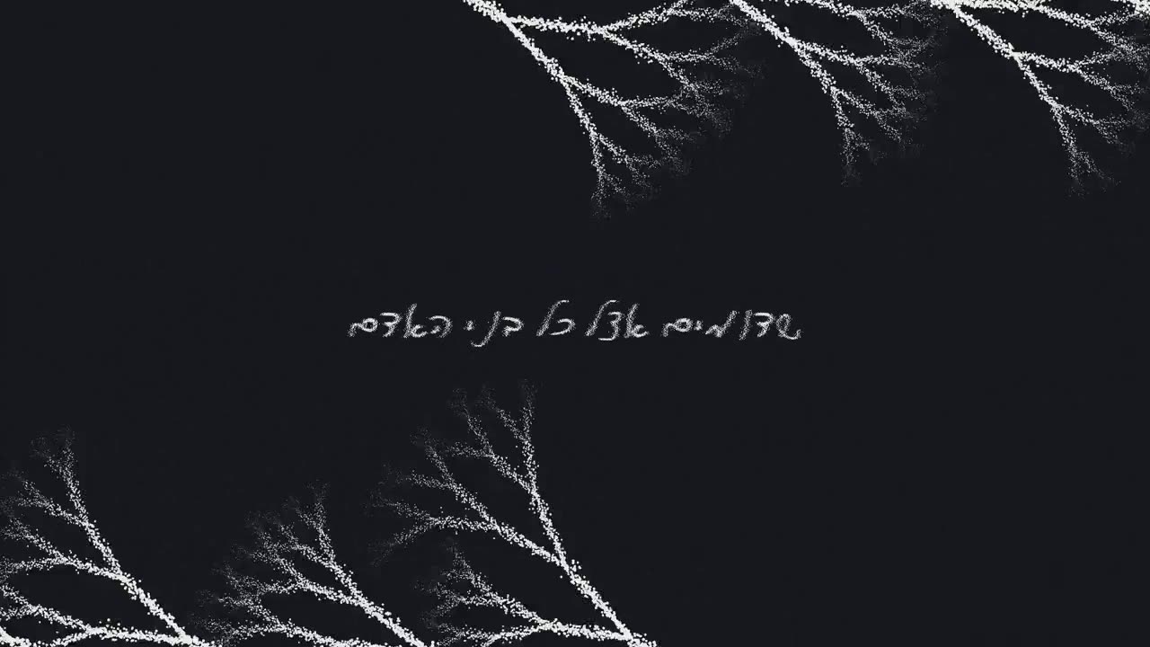
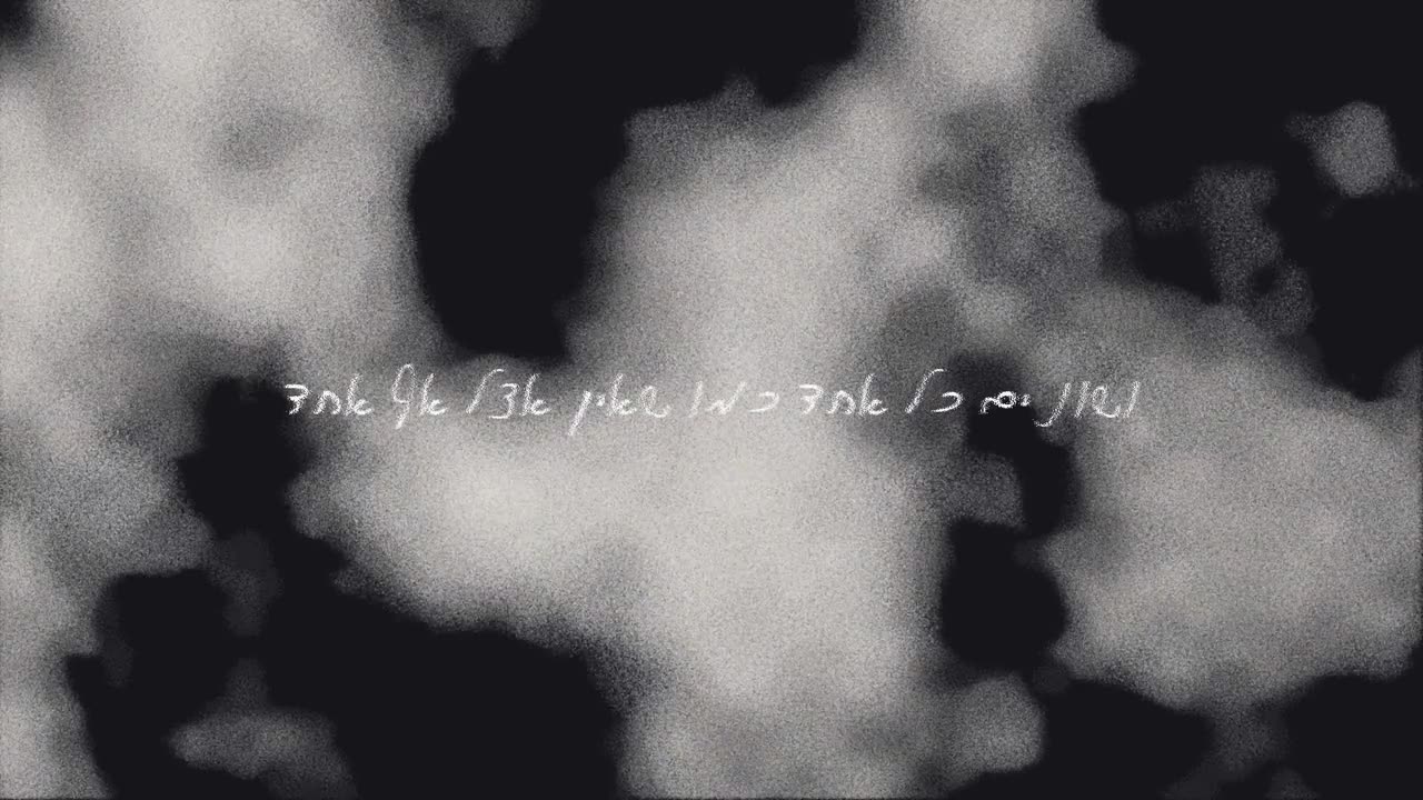
Handwriting → a typeface · a song → images in code
Typeface & generated visuals · 2024
A typeface built from handwriting, letter by letter, and every image in the film generated in code with p5.js.
Shelter adoption ads → people waiting to be adopted
Adoption posters for people · 2025
A speculative future where humans wait in shelters to be adopted, written in the language of real welfare NGOs.
Available now · Tel Aviv or remote
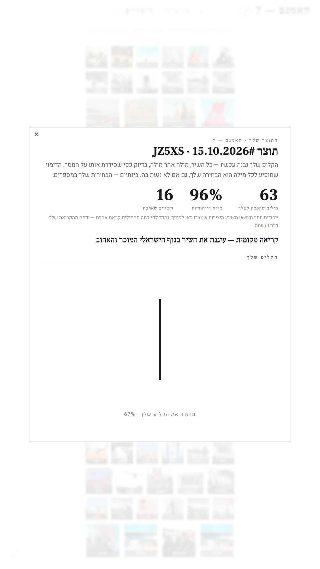
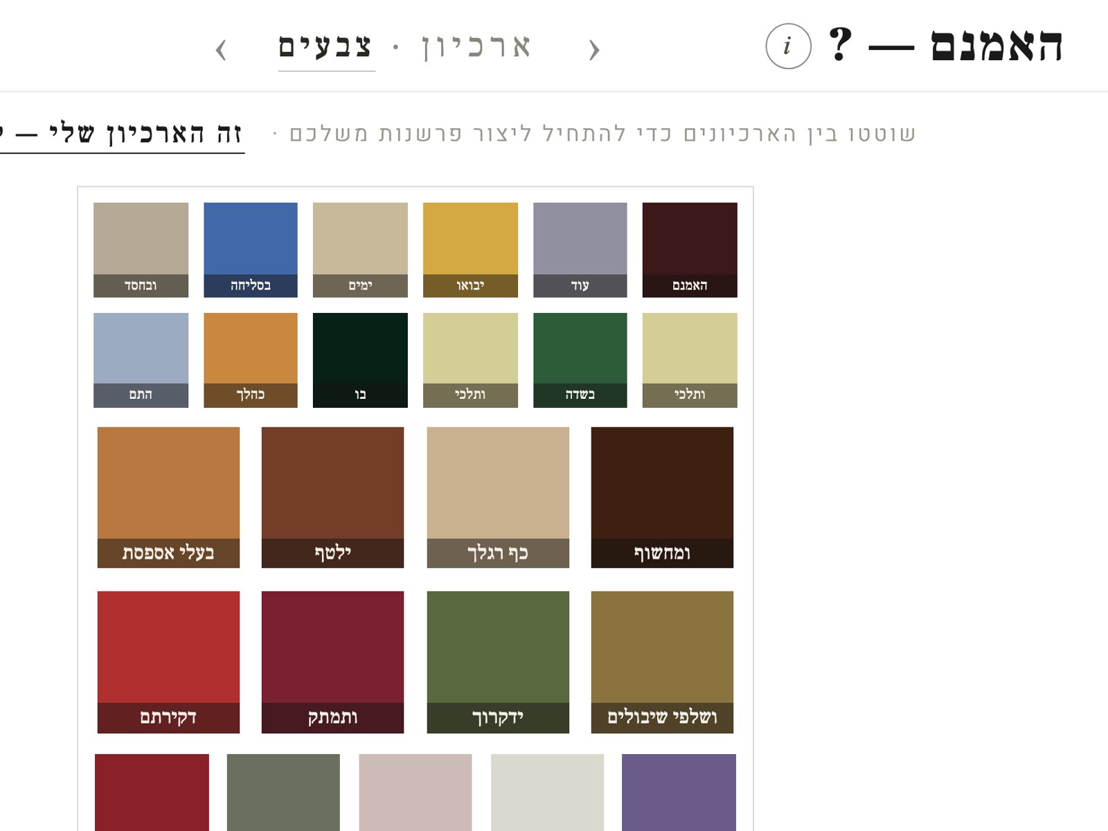
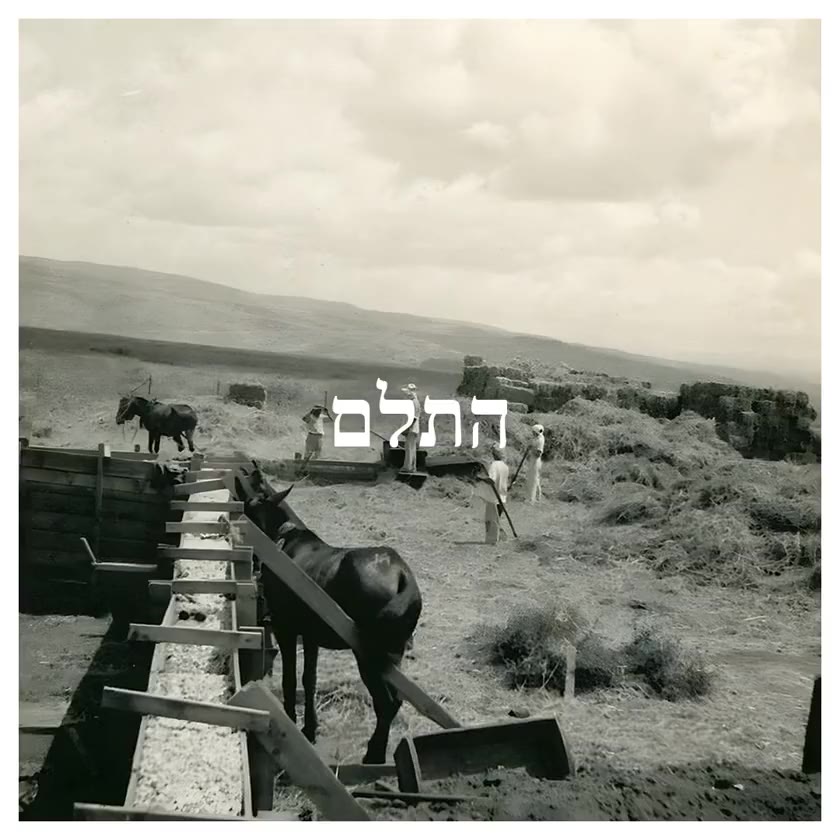
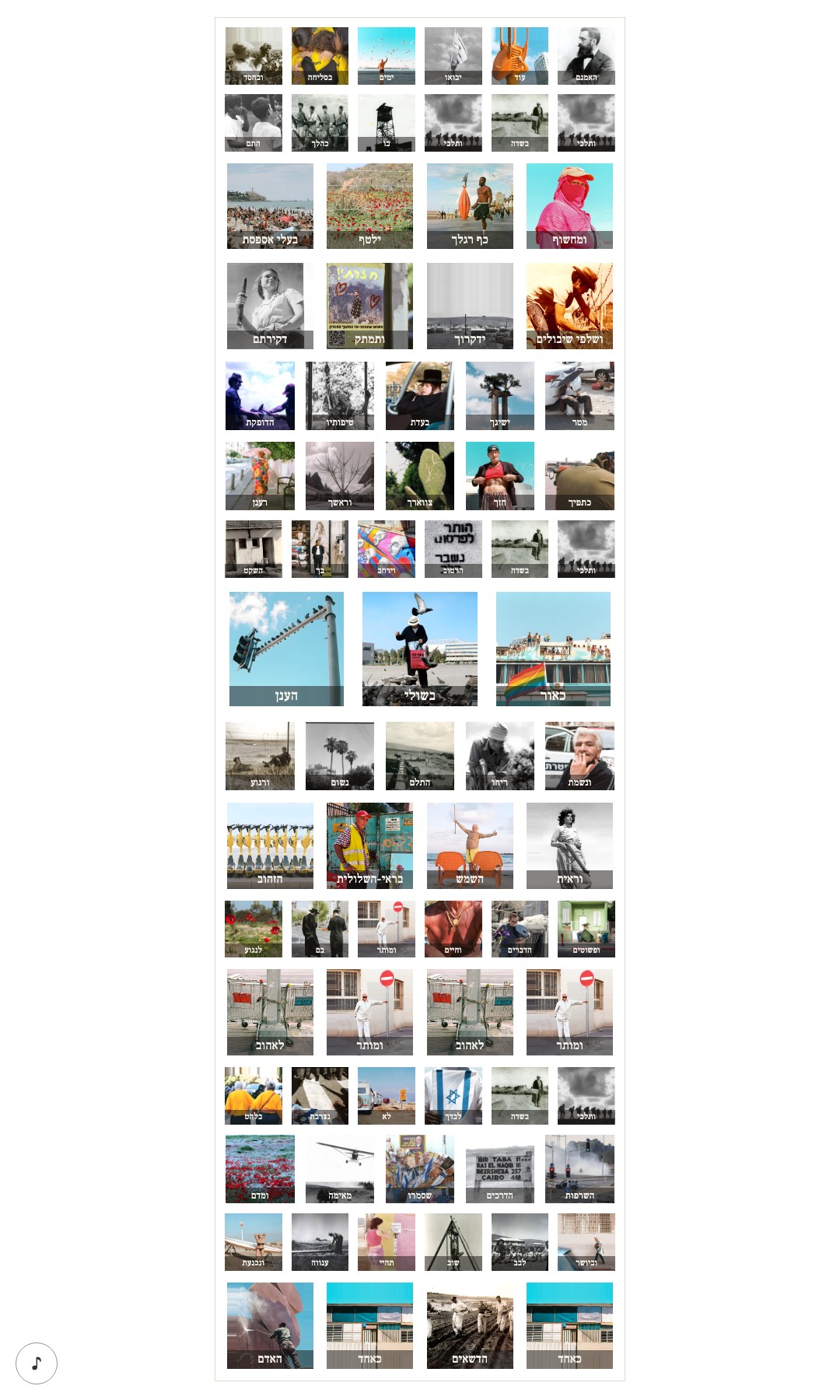
Lea Goldberg’s האמנם, a poem everyone here grew up with, taken apart into seventy words, and every word given ten possible bodies: a photograph, a colour, a definition, a GIF, or the word left alone.
Choosing them took months. Around 700 images, placed one at a time by judgement and never by keyword: which photograph can hold בסליחה, which colour is יבואו. That decision, repeated 700 times, is the work.
The piece asks whether an image can carry what a word carries. Visitors answered by choosing.
Visit haomnam.com, it speaks for itself ↗
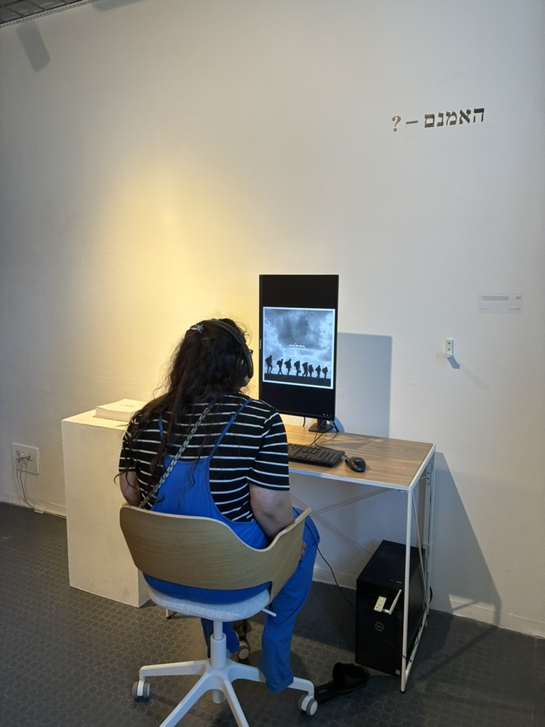
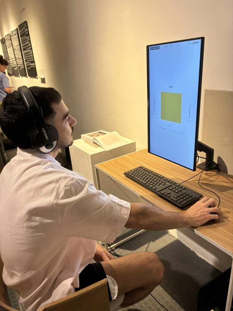
Made for strangers’ hands. It forgets whoever sat there before you, so no one inherits someone else’s poem. Any word can be looked up. And the film you end up with leaves with you.

On paper first
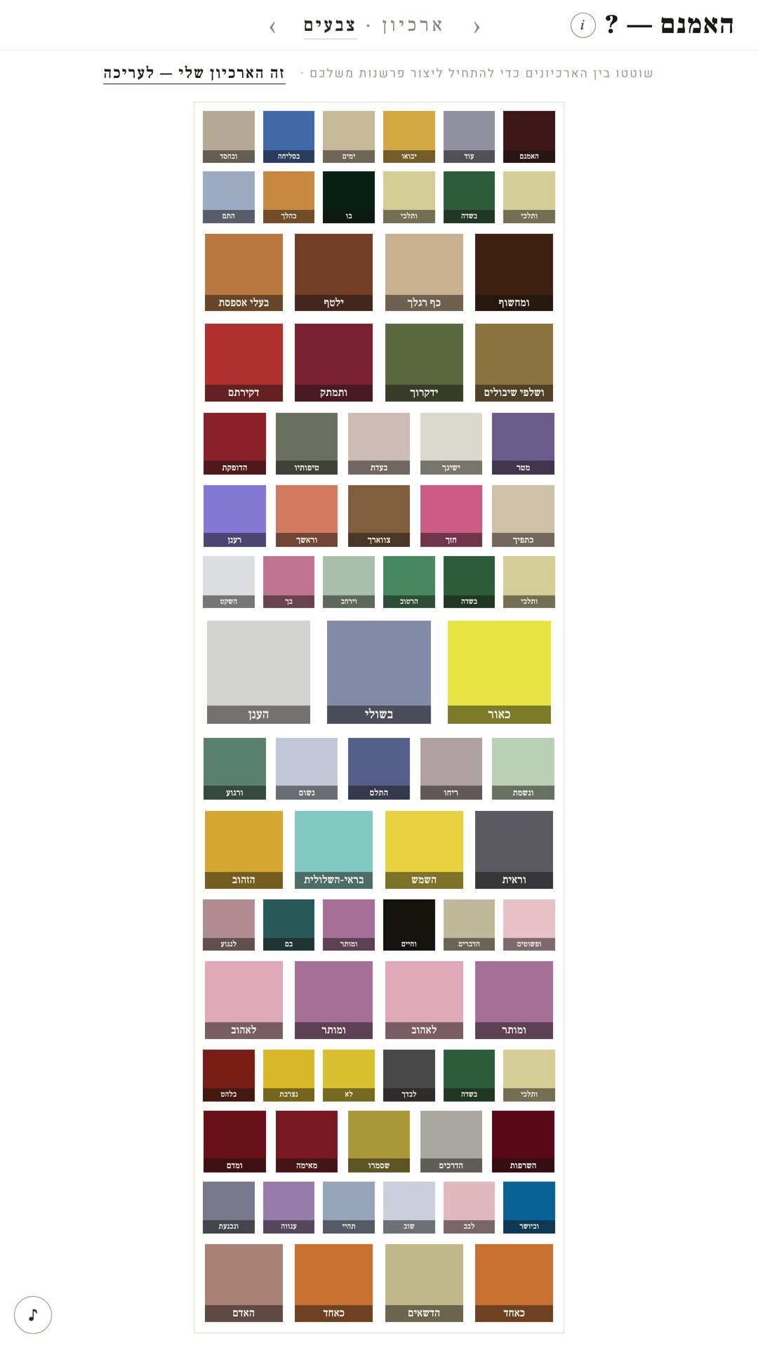
Seventy words, seventy torn swatches, arranged and rearranged by hand until the colours argued correctly.
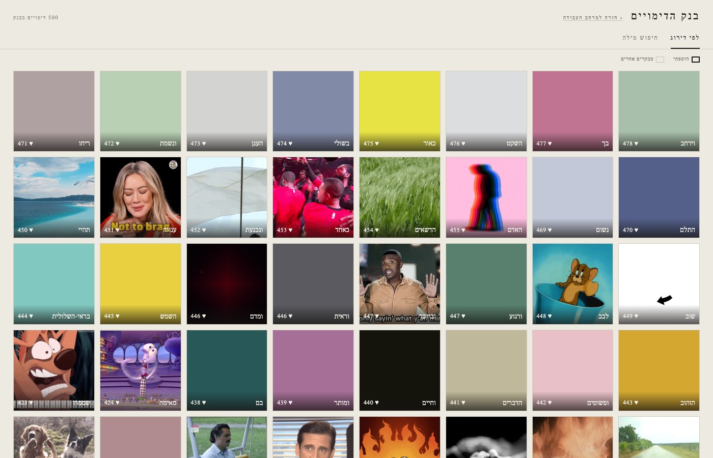
Then a colour system
The board became data: a colour assigned to each of the seventy words, argued one by one, and a tool to re-sort and test them.
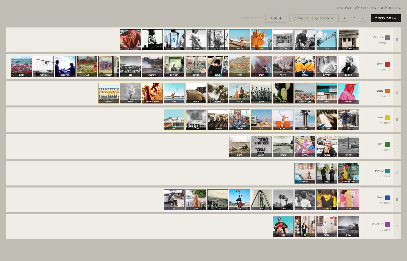
Then the index
Software to hold it all: 700 images, seventy words, ten archives, and a way to see, at a glance, what was still missing.
Play with one of the tools, live ↗
sensitiveinjection asks what happens if you give a machine something it was never built to have: a soft spot.
Speculative research, Shenkar 2025: an interface that looks familiar and behaves like no product would. It runs here, live. Ask it for something, and see what it does with the request.
Before I could make the piece, I had to make the things that make it.
On paper first
Seventy words, seventy torn swatches, arranged and rearranged by hand until the colours argued correctly.
Then a colour system
The board became data: a colour assigned to each of the seventy words, argued one by one, and a tool to re-sort and test them.
Then the index
Software to hold it all: 700 images, seventy words, ten archives, and a way to see, at a glance, what was still missing.
The tools kept coming as the piece needed them: a bank browser, a colour sorter, a curation workspace, a scan archive, a book builder, a sound-sync mapper for the poem read aloud, a clip renderer. The same tools ran the exhibition, the printed book and the film that leaves with each visitor: one image bank, one colour map, several outputs.
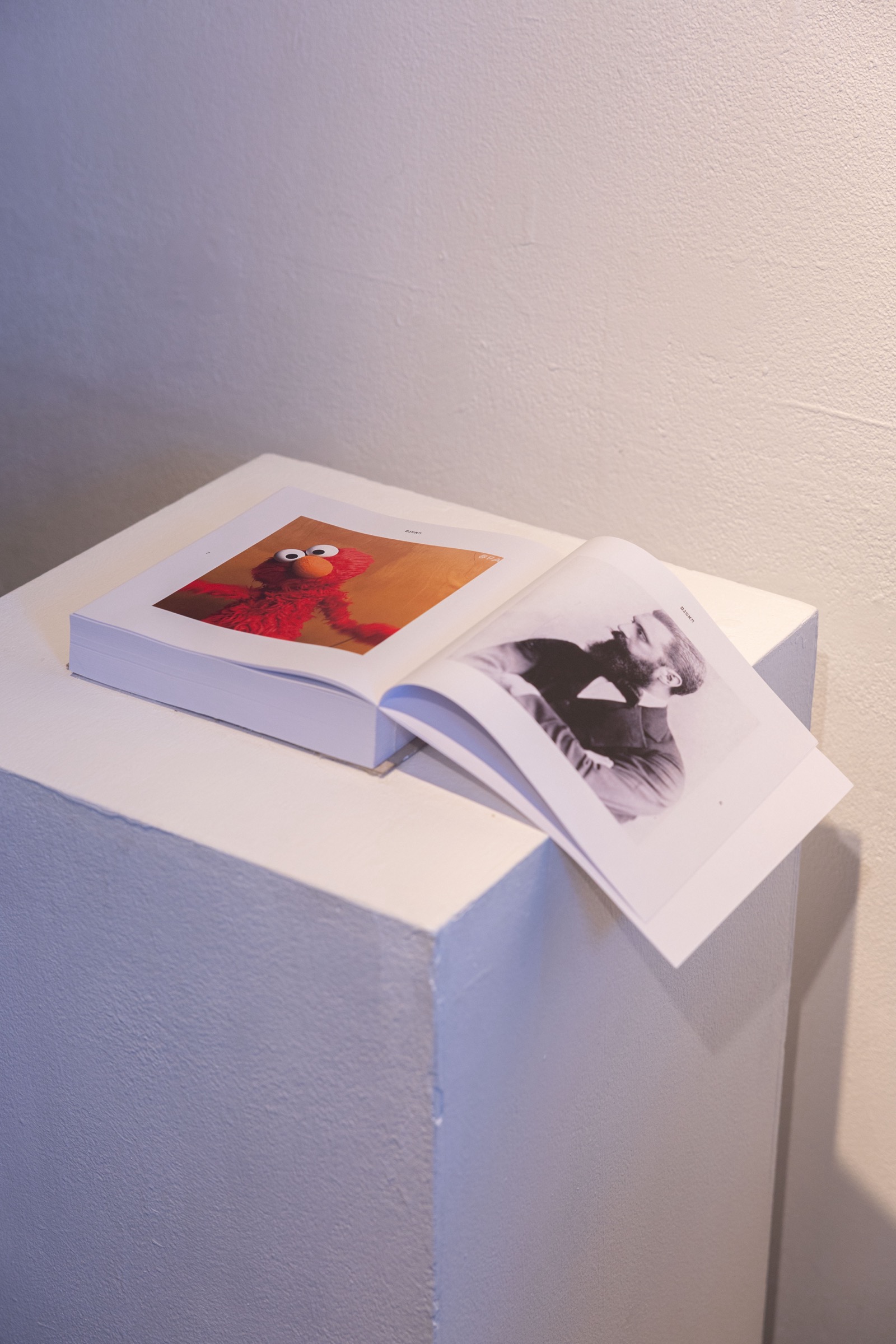
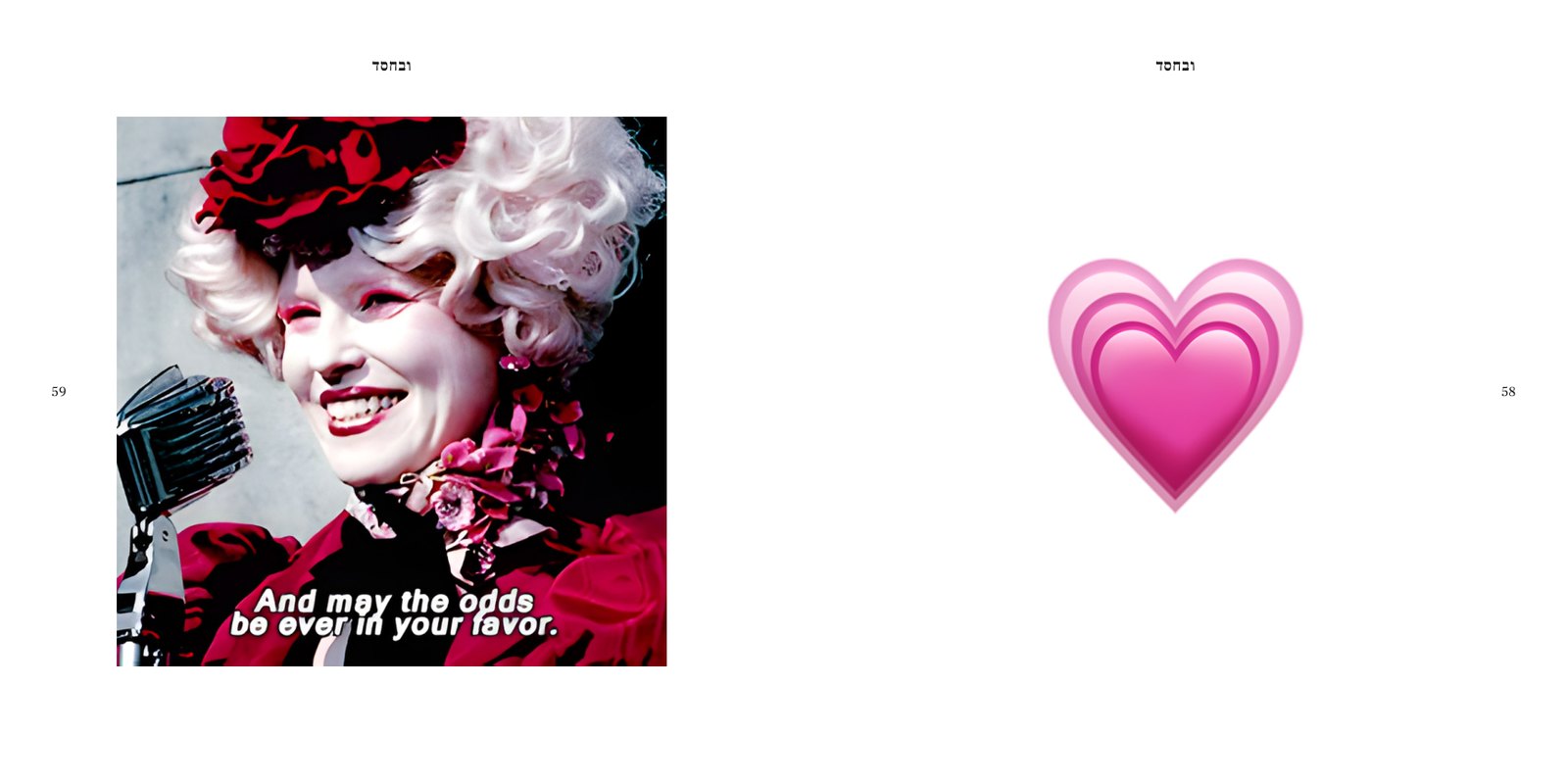
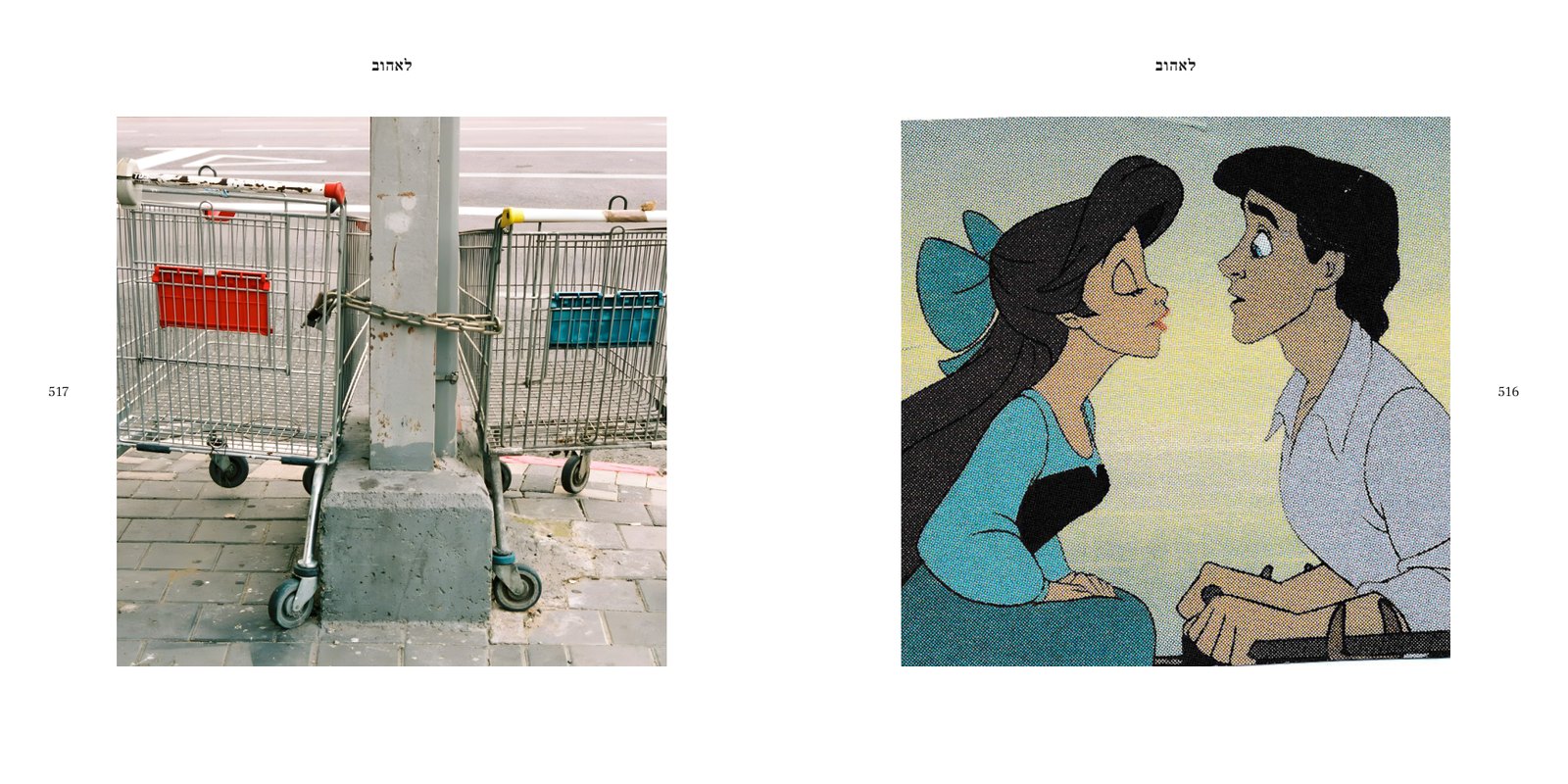
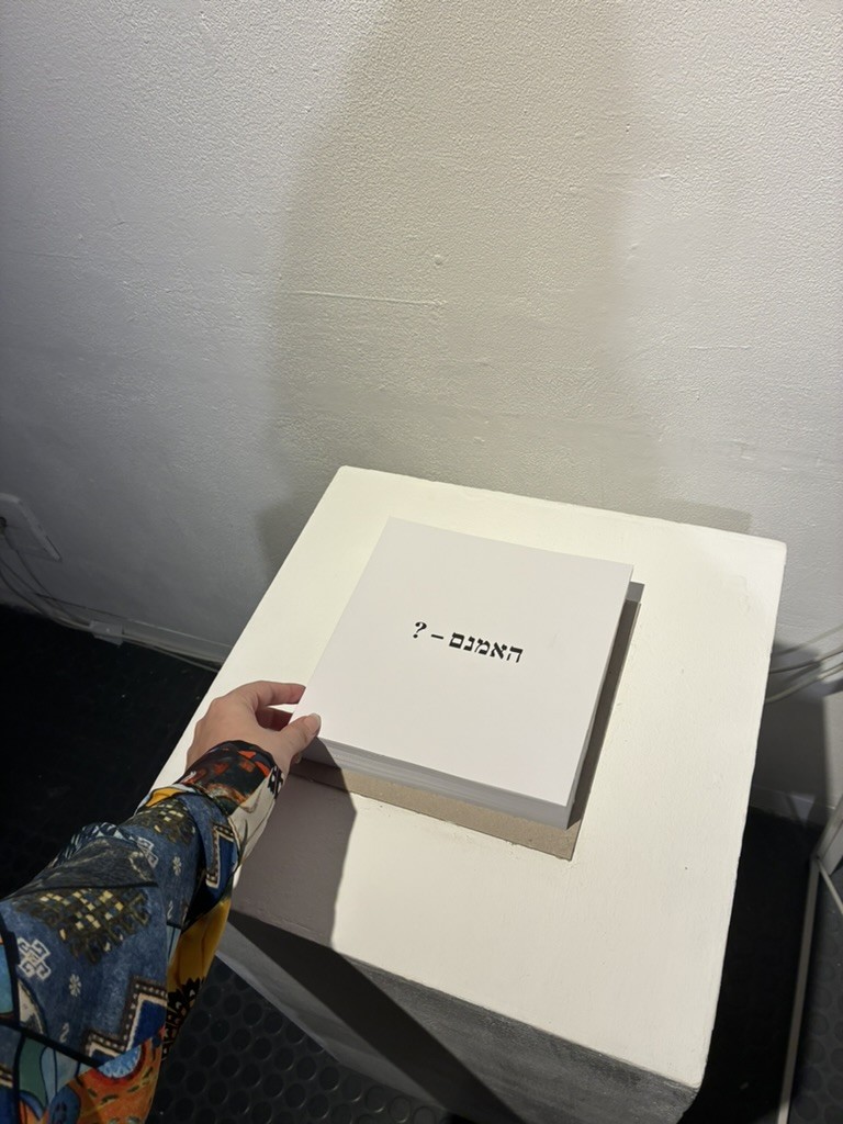
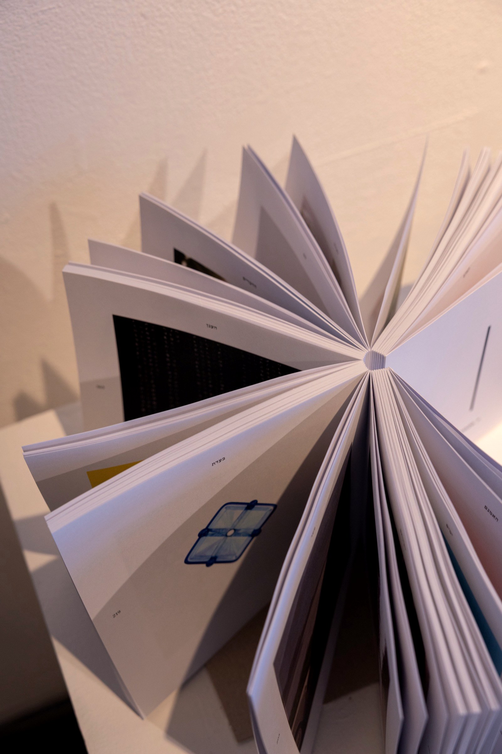
The exhibition’s poem, fixed on paper: every word of the poem with the image that was chosen to carry it, one pair per spread, 20×20 cm, offset, bound with an exposed spine.
Hebrew reads from the right, so the book is paginated the way Hebrew reads: it opens on the right page, and every spread is a pair, a word facing its image. Around 700 images, placed one at a time by judgement and never by keyword.
צער בני אנוש: adoption posters for people. Made with AI, leaning on AI’s own aesthetics: a speculative future in which people live in humanities, shelters, but for humans, waiting to be adopted.
Deliberately near anti-design, in the language of real welfare NGOs. It echoes the society we are becoming, and who we are today. Three posters, 1080×1920, looping: a person, a collar, a leash, and one button, הוספה לסל.
בואו לקחת חבר לחיים, ולהציל חיים.
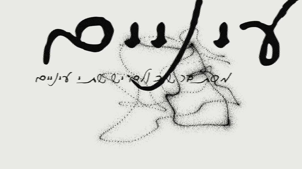
A short film for a Meir Ariel song. The letters are a typeface built from handwriting, glyph by glyph, through a Calligraphr template; everything that moves behind them was generated in p5.js.
Type design, sound and motion in one piece: the lines, the orbits, the branches and the clouds are all code.
B.Design, Shenkar 2026. Before design: six years as an intelligence officer, research and analysis. During the degree: graphic design at Shaldor, product characterisation at BRIA, and an independent art exhibition produced end to end.
Since: a final project that ran as a public exhibition for eight nights, a channel identity, four title sequences, a typeface, and the tools to build all of it, written in code. Behind the films: my own photography, and production experience that is not on this site.
Tools: After Effects, Premiere, Photoshop, InDesign; Midjourney, Runway, Kling, Gemini; p5.js, HTML/CSS/JS, Python.
Looking for a brand, motion or product role, Tel Aviv or remote. Get in touch.